How can we improve on an existing app to allow users to watch and dig into live cryptocurrency market data in a digestible, mobile format while balancing ease of use with extremely dense information?
How it went
For this project, I was at an agency working with one of our clients. The client’s goal was to have a research-backed understanding of their current users needs, any user flows for new features, and medium-fidelity wireframes that fully spec’d out new features and improvements. Once the client had that information in hand, they planned on applying a new branding style to the wireframes, and developing the changes in house.
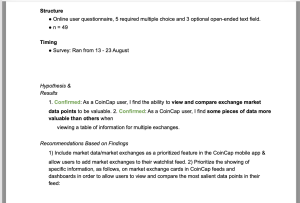
We needed to understand what current users wanted from this app, what pain points they had and what they didn’t want. At the same time, the client wished to increase engagement with the app. I worked with the client’s project manager to survey current users about their priorities and how they used market data in their current workflows. With the results of that survey and understanding what users wanted, we identified several new features we could add to the app. Part of our first research report is below.
Using the results, I designed new features based on user feedback. I focused on preserving usable interactions that currently existed to reduce the learning curve with the new app and website features.
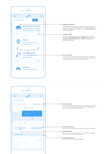
One of the more challenging changes included the creation and display of data-heavy tables that would be easy to read on mobile screens. The app is extremely data-intensive, and updates constantly as a user views the screen. In addition to making sure the data was usable, we had to make sure the displayed data was useful as well. We had little room for error stating which data was primarily important to users, secondarily important, and tertiary to lower importance. With research validated data priorities in hand, I designed several different ways of displaying data and tested with users to find the one that resonated the best.
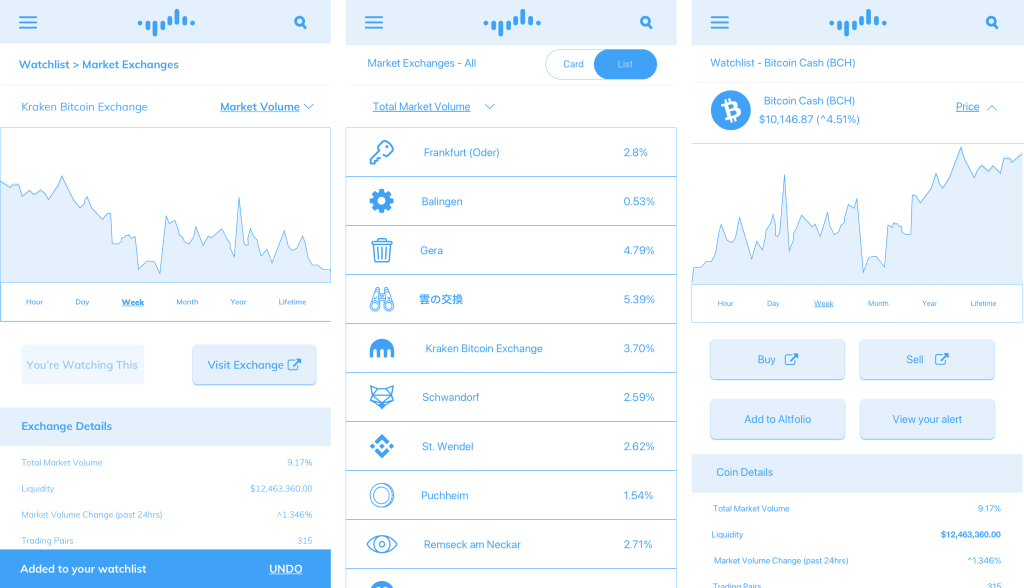
Another challenging change was refining the navigation structure of the app that allowed for the inclusion of several new sections, but would not be unrecognizable or confusing to long time users. Similar to finding the right path for which data to display, and how, I used the current app’s structure and developed a natural way to insert more sections and features without breaking existing patterns.
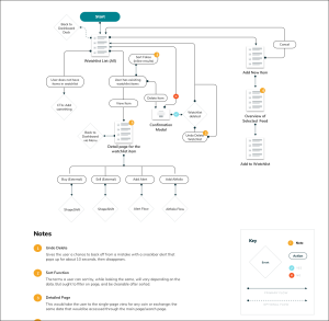
Once the research had been refined and distilled into medium fidelity wireframes, I passed a design package off to the client that included not just wireframes – but user flows, maps, instructions and more for the visual designer and developers to use as the development of the app moved forward.
The launch of the app was delayed for a number of reasons – eventually, many features were de-prioritized. Our work with finding the VIP data points users look for, and the resulting tables and graphs to display those data points remained in the final launch for the new version of the app.
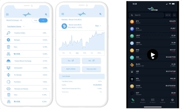
This is my original wireframes against a current screen recording of the live app.