Case Study Overview
Client/Project
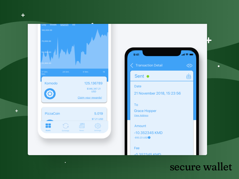
Community powered technology platform wanting to offer a user-friendly wallet
Role(s)
Researcher, UX Designer, Usability Tester
Goal(s)
MVP plans for a cryptocurrency wallet that focuses on self-onboarding
Main Result(s)
Blueprints for user-friendly interactions on the blockchain
The Process
Main Tools & Techniques Used
- Competition Research
- User Surveys
- Sketching, whiteboarding & wireframing
- Usability Testing
What Happened
Research + User Surveys
With the problem first presented, the team examined the current collection of wallets the client had built in the past, what platforms those worked on (laptops, mobiles, etc.) and what current user comments were. I conducted stakeholder interviews to learn more about what they hoped to accomplish and the benchmarks they hoped to reach. With a larger adoption of the currency as one, by a larger number of people, we set out conducting a user survey with the current user base.
We conducted a short survey of 10 questions and had over 100 responses. We set out to find what people use to hold their cryptocurrency, and why they made those choices. We asked about why they opted for certain devices over others, and learned that people used wallets across different devices for different purposes: hard wallets for secure storage, laptop wallets for research and keeping up with the portfolio and rewards, and mobile for checking on balances and quick actions.
Users in the survey also sent out a clear call for an easy to use interface, something that just didn’t look good, but also worked smoothly. This specific user base not only wanted something easy to use for themselves, but as a stronger ideological need to help something they believe in (blockchains and cryptocurrency) succeed.
With user goals and stakeholder goals in mind, I set out to contemplate all the information presented in the app – and organize it in a way that would make sense to a broad spectrum of users, as well as supporting the idea that learning through interacting with this information would aid learning and encourage tentative users to become full-fledged experts.
After many whiteboarding sessions with the larger team, we had a better idea of where the information fit into features, and where those features fit into the larger app. For the mobile app, I made a hierarchical chart that displayed where information lived, and what top level persistent actions or features we had identified. This guide was used as an “at-a-glance” map for all of the possible user flows that would be created after this.
User Flows
Alongside the informational organizing, I outlined user flows that simplified actions and made room for onboarding and/or tutorials that would ensure a user had the chance to learn about a process as they were going through it. We spent a great deal of time working on getting to the basic requirements of cryptocurrency transactions – where user input was needed, where it wasn’t, and how much help you can offer a user without posing a perceived security risk. We also worked on ensuring that actions like sending and receiving were well explained, but brief and to the point.
Wireframes
Once the user flows were in place, I identified the screens that would need to be created to support the flows. Back to the whiteboard, we sketched out many options for presenting heavy information on a page without overwhelming the user. At this point, I was able to precisely note where tool tips and other inter-page information needed to be available to the user, based on user survey results and comments.
Once I had a general idea mapped out on whiteboard, I turned them into wireframes in Sketch, focuses on showing a user only what they needed to know to successfully complete the task at hand, but also allowing a user to dig for more information and learn at their own pace.
Prototyping + Testing
Once we had some initial wireframes, I stitched them together into a prototype for testing. I identified some specific aspects of the prototype to test – i.e. our bottom menu would add navigation, and that our intend to have users ‘learn through interaction’ would be successful.
I ran a qualitative survey with 5 participants. I asked the participants some initial questions, ran through some identified tasks with the prototype, and recorded the results with audio and in-testing notes. Testing revealed that our language in-app needed tightening; there was too much reliance on jargon. Regardless with how smooth a flow was, if a user did not understand the technical jargon, the cognitive load was increased, and not decreased. The language of the app was given a complete overhaul, and special attention was paid to icon labels as well.
Final Results
The wireframes were passed off to visual design, and then to development. The app is slated to be released in the late summer/early fall, and will be watched to assess what the next steps for design and UX will be.